Arist


Overview
Arist is an AI-driven e-learning service provider that helps organizations train teams and employees 10x faster by leveraging artificial intelligence. Designed for efficiency, Arist transforms traditional training into digestible, engaging, and highly personalized learning experiences. By utilizing AI-generated courses, bite-sized content delivery, and seamless integration with workplace tools, Arist ensures that employees can upskill rapidly without disrupting their workflow.
The Problem

Francois Labs was brought on to revamp the website and provide a comprehensive brand refresh. The current website suffers from significant inconsistencies, poor design choices, and a lack of cohesive structure, making it challenging to navigate and engage with. The project involves addressing these issues by implementing a more consistent visual identity, improving the user experience, and ensuring the website aligns with the brand’s overall vision. Through thoughtful design improvements and strategic updates, Francois Labs aims to create a more polished, functional, and engaging digital presence.

The Solution
The primary objective was to establish a consistent design system while addressing areas that lacked cohesion. By refining the design language and strengthening weak points, we created a solid foundation for the brand’s visual identity.
With a structured and cohesive design system in place, we were able to move forward with the next phase of the project: developing more consistent and visually unified web pages. Leveraging the newly designed elements, typography, and assets, we ensured that each page adhered to the updated brand standards, enhancing both aesthetics and usability across the website.
The Design Process

Design System Refresh
We started by refining the design system to ensure consistency across all touchpoints. The logo was already well-designed, so we incorporated it from the original assets without modification. The primary font, Inter, was retained for readability and brand familiarity. Additionally, we expanded the color palette, introducing more secondary colors and complementary combinations to enhance versatility while maintaining brand alignment. To modernize graphic elements, we transformed intricate designs into vector-based shapes, aligning them with the brand’s triangular logo. This approach created a visually cohesive and scalable design language.

Typography Enhancements
To further elevate the brand’s visual identity and improve readability, we introduced two new fonts alongside Inter:
Reckless Neue – A sophisticated, modern serif that adds a refined and premium feel to headlines, key callouts, and branding elements. Its elegant design contrasts well with Inter’s simplicity, providing a more dynamic typographic hierarchy.
Monument Grotesk Mono – A structured, monospaced sans-serif that brings a contemporary and technical touch. This font is ideal for supporting text, small captions, and functional UI elements, ensuring a sleek and modern appearance.
By integrating these fonts, we established a balanced and versatile typography system. Reckless Neue adds personality and character to prominent elements, while Monument Grotesk Mono ensures clarity and structure. These choices, combined with Inter as the primary body font, create a harmonious, distinct, and user-friendly reading experience across the website.
Enhanced Visual Elements
To enhance the visual identity, we experimented with gradients, crafting visually appealing background elements to add depth and engagement to the design. These gradients were strategically applied to key sections, making the website more dynamic and visually engaging.

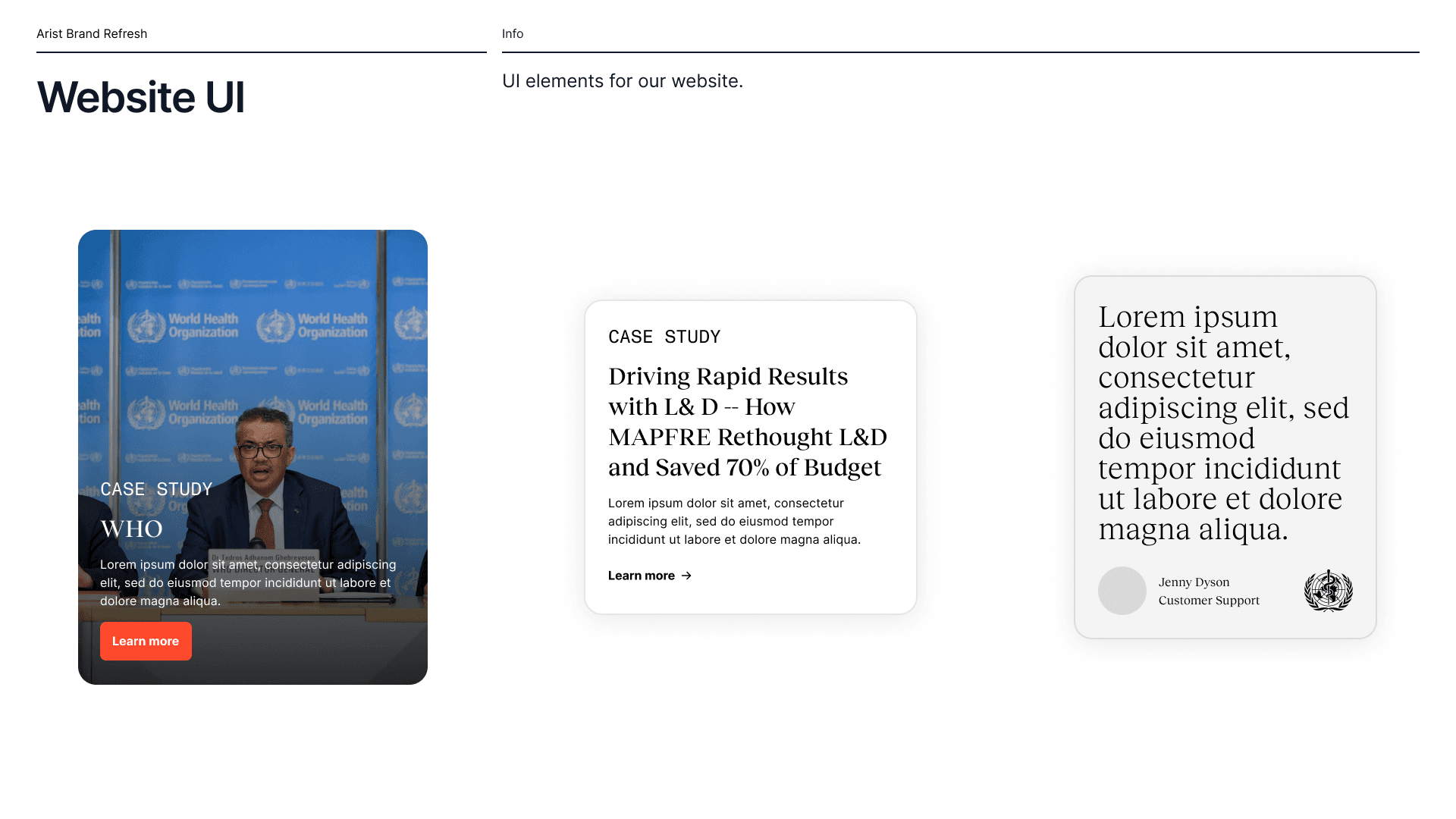
UI & Website Improvements

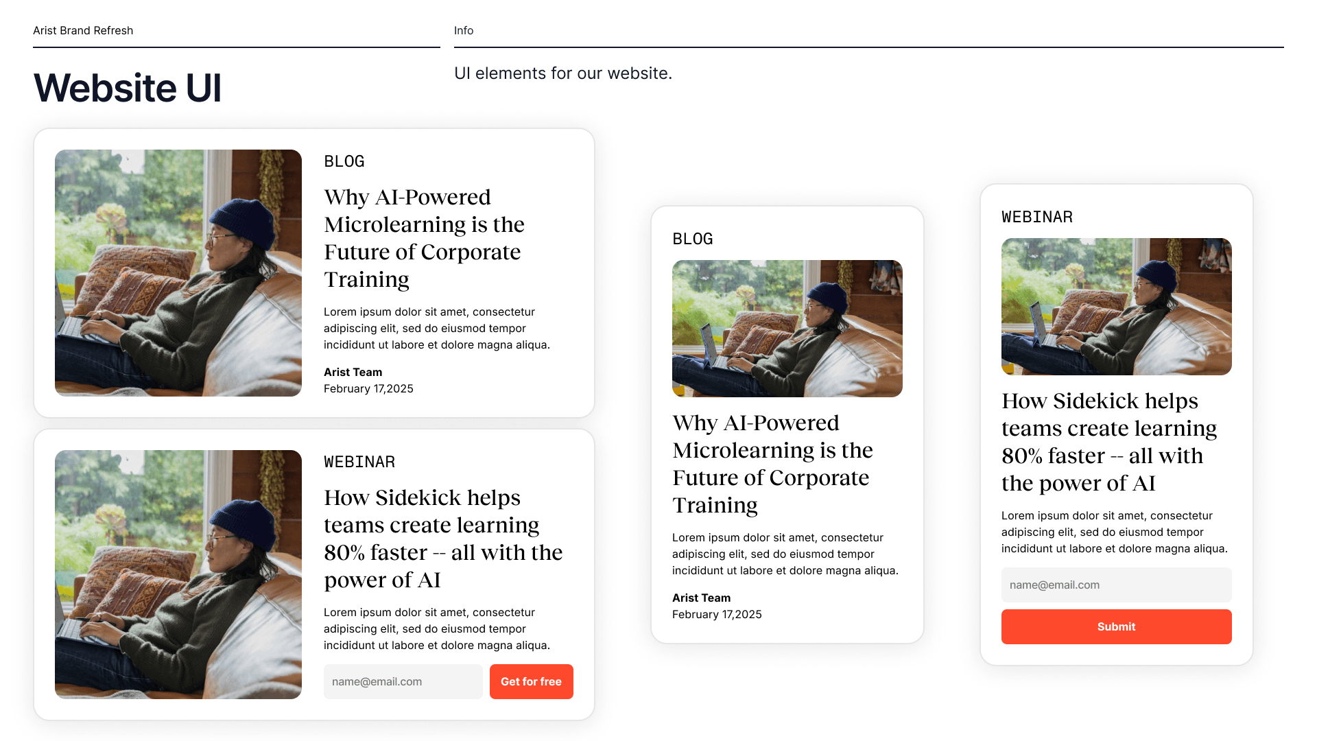
The existing website UI was clunky, lacking structure and consistency. We developed a new template for UI elements, particularly refining the blog post layout for improved readability and engagement. The quote sections were reimagined to stand out and feel more impactful. Previously, they appeared insignificant; we redesigned them to be more prominent and visually compelling.
We introduced varied layouts, strategically integrating the redesigned vectors and gradients to create an aesthetically pleasing and user-friendly experience. Lastly, we refreshed the website’s photography, utilizing high-quality images from sources like Pexels and Unsplash to enhance the overall visual appeal.
Through these thoughtful updates, we transformed the website into a cohesive, modern, and engaging platform that reflects the brand’s vision while providing a seamless user experience.


Conclusion & Results
By implementing a comprehensive design system refresh, we successfully addressed the inconsistencies and inefficiencies in the previous website. Through refined typography, an expanded color palette, and modernized graphic elements, we established a cohesive visual identity that aligns with the brand’s core aesthetics. With these enhancements in place, we not only improved the website’s usability and design consistency but also reinforced the brand’s identity in a way that is scalable for future growth. The end result is a polished, modern, and user-friendly digital presence that effectively communicates the brand’s values while ensuring a seamless experience for users. Lets see what the founders think!

